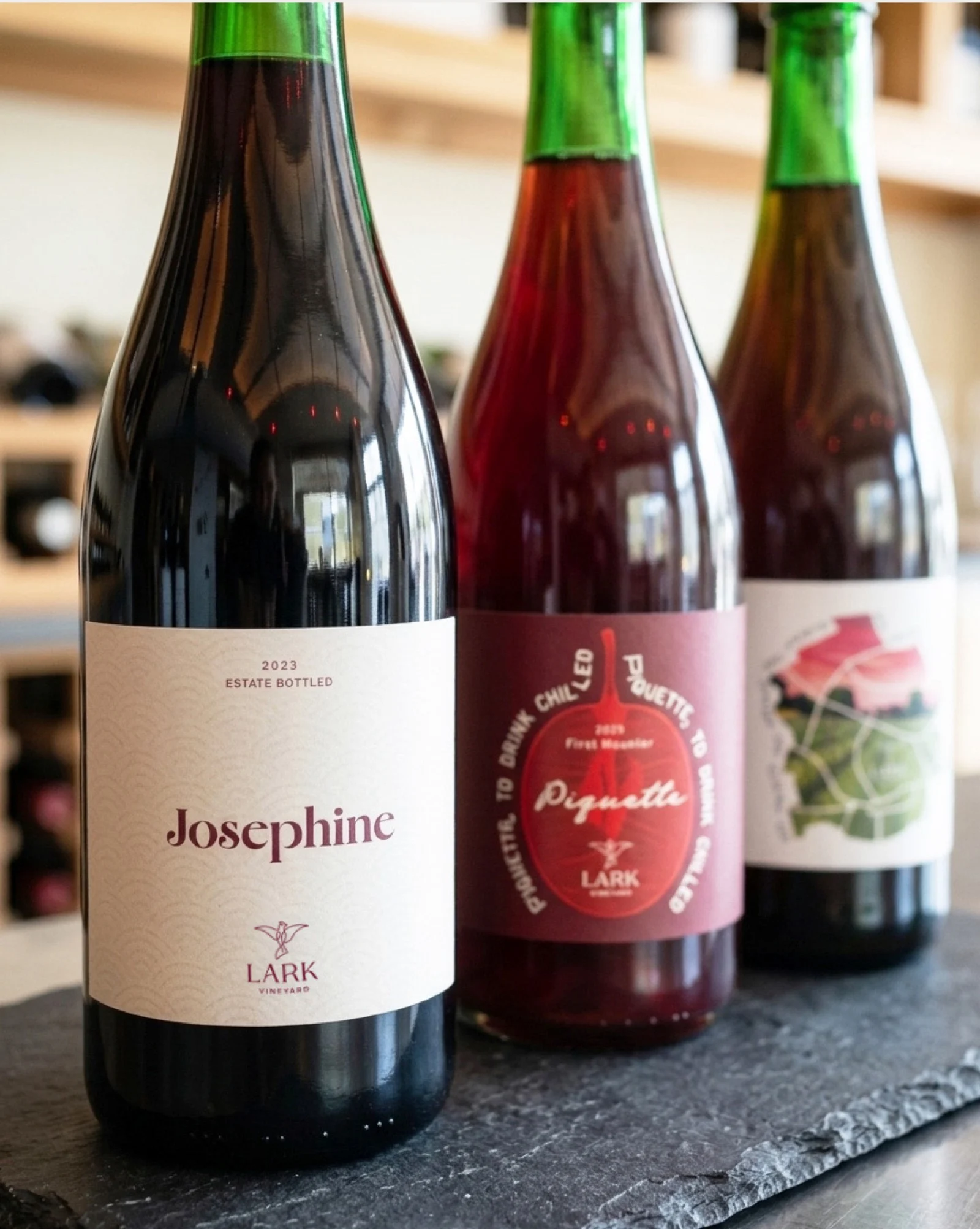
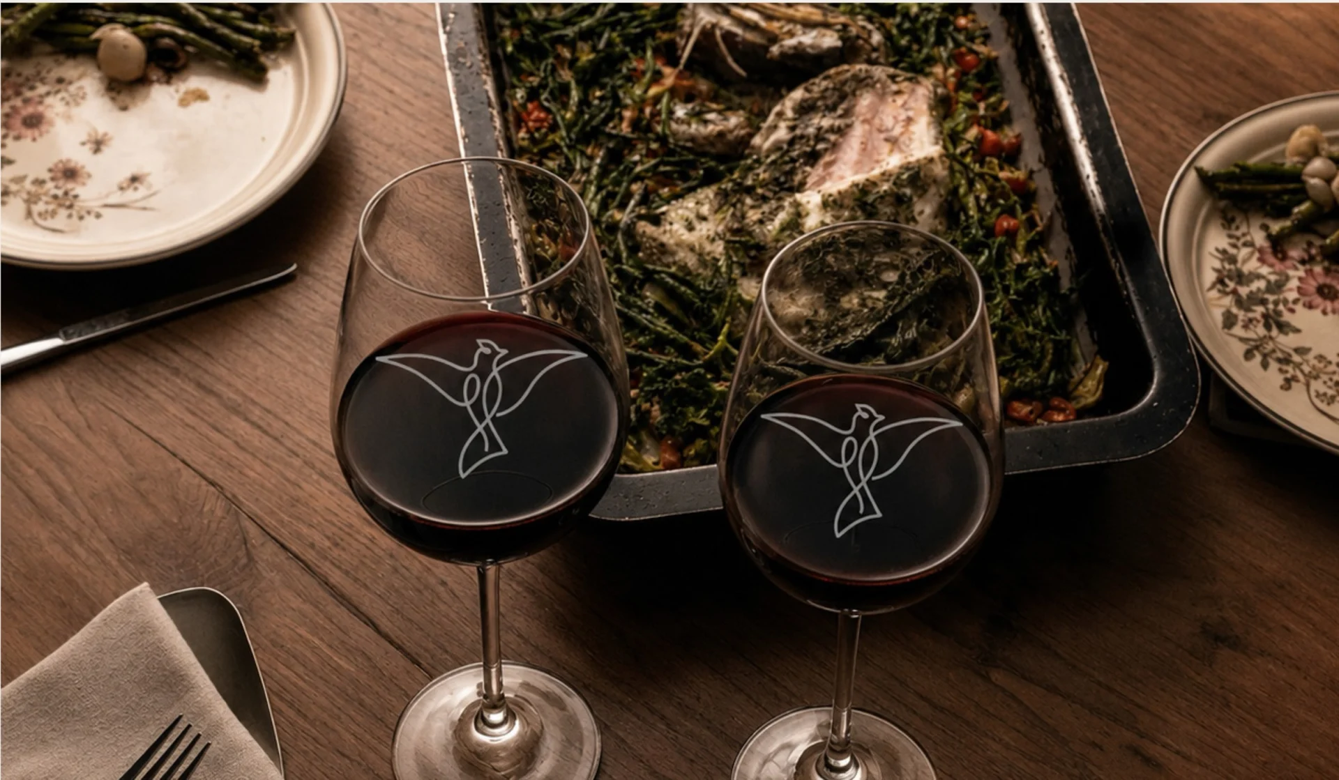
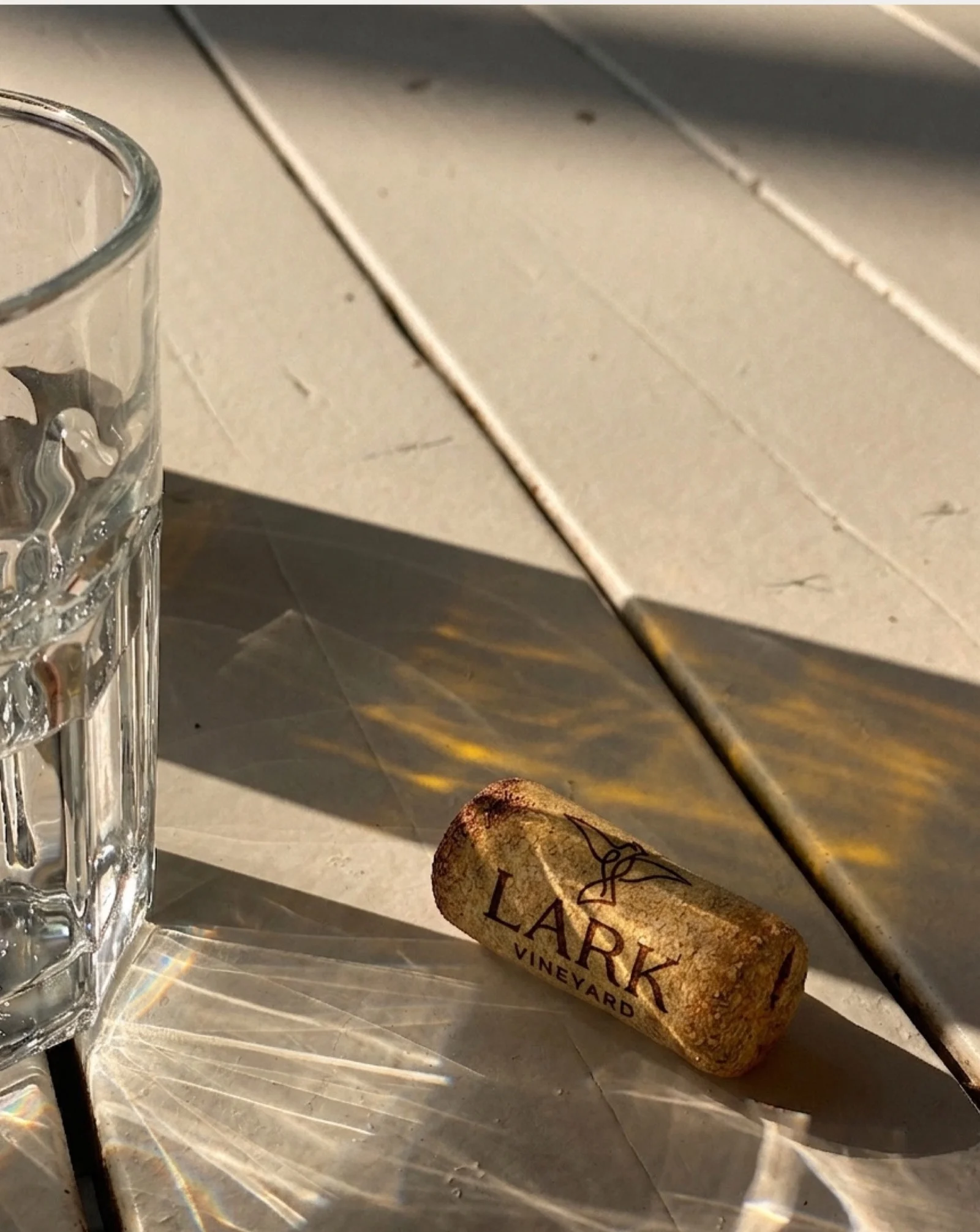
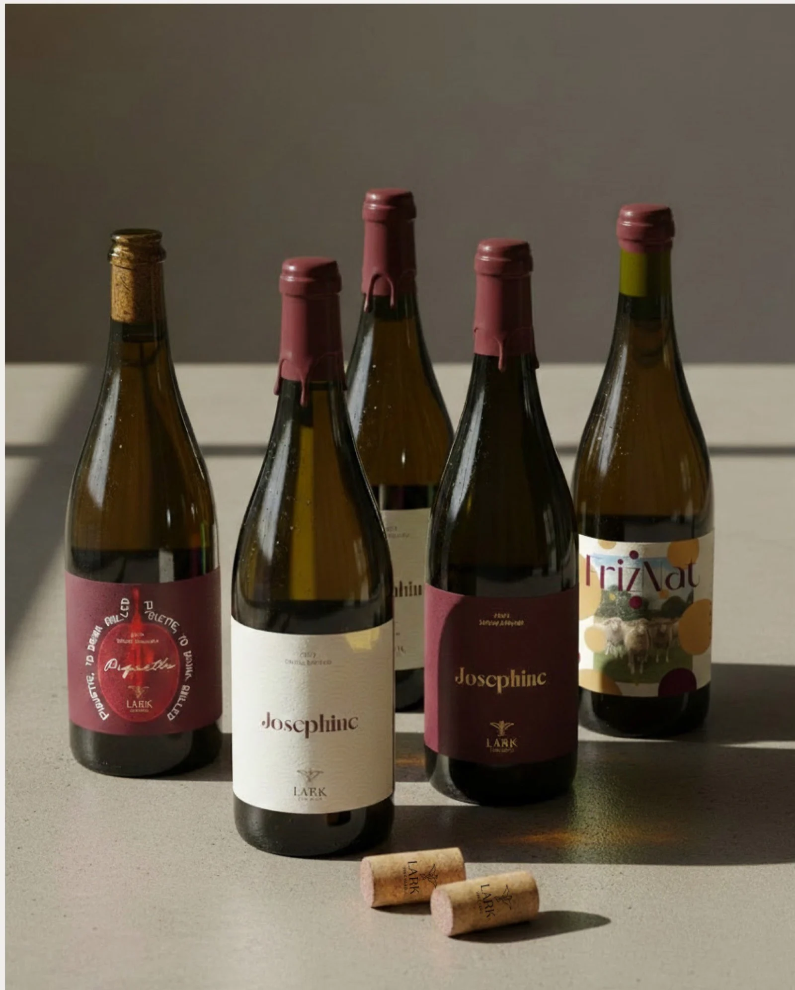
We partnered with Lark Vineyard to develop a complete, multi-platform brand identity, creating a consistent narrative across both physical and digital touchpoints that honours their farm-to-bottle journey.
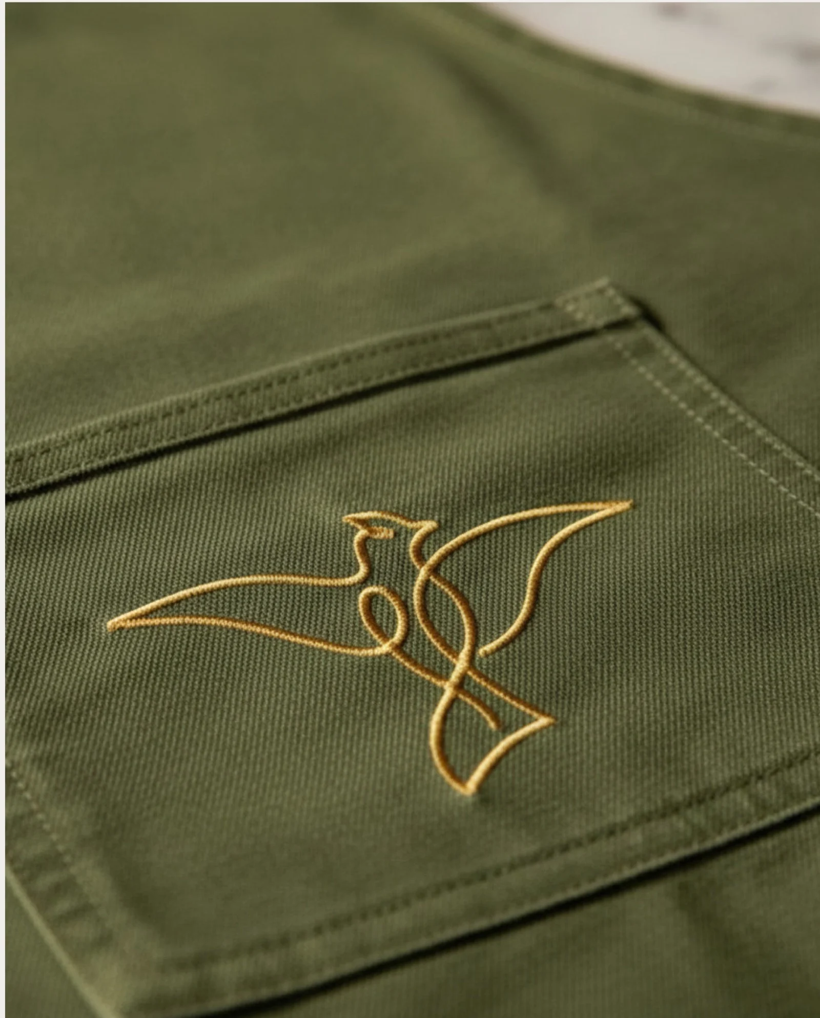
We built a unified core brand system – including a primary logo, submarks, and detailed brand guidelines covering typography, colour palettes, and brand voice. Translating this new visual identity to physical touchpoints, we designed a collection of bespoke wine bottle labels for their unique varieties, ensuring a distinctive and recognisable presence from the shelf to the table.